

The goal of this project was to create an updated Salesforce List View experience based on Salesforce's IdeaExchange submissions.
There is an entire platform called the Salesforce Idea Exchange where Salesforce users all over the world can name and vote for ideas that they believe the Salesforce team should work on. Through research on this plaform, it was found that Salesforce users needed certain features added to Salesforce list views to enhance their experiences.
This project was taken on as a personal project after reviewing some of the grievances and needs Salesforce users were expressing on the IdeaExchange. The goal of this project was to successfully incorporate 3 new features into Salesforce list views: quick filtering, conditional formatting, and the visibility of total number of records.The addition of these features leads Salesforce users to having a more efficient and tailored experience when utilizing list-views.
In the end, users expressed these features as tools that would make their day-to-day list view experience as "powerful and more productive".
The completion of this project resulted in a fully working and tested prototype ready to share with Salesforce Idea Exchange product teams.

The Salesforce IdeaExchange is a community platform where Salesforce Trailblazers can share ideas with each other and ultimately product teams at Salesforce. Ideas can be voted on, and the more votes an idea gets, the more Trailblazers in the Salesforce community would like to see it happen. With every Salesforce release, highly voted ideas get picked up and worked on by Salesforce product teams.
I decided to begin this project by searching through the IdeaExchange and finding popular sentiments around what real Salesforce users need out of the tool to aid their daily productivity.
There were 3 ideas surrounding list views on the IdeaExchange with a high number of upvotes and comments that I decided to focus on. These were also features I personally saw my colleagues and customers being able to benefit from as well:


After reviewing the comments from the voices of users who expressed their need for these features, common pain points among users were:
Not being able to select total number of records at once leads to a cumbersome experience of trying to mass edit records that aren’t automatically selected
Increasing number of unimportant list views slow down Salesforce performance
Current formula field options to assign visual identifiers to important data are limited and don’t compare to formatting capabilities of less powerful CRM tools.
Here are the Trailblazer profiles of some of these users who shared their pain points with the lack of these features in Salesforce List Views, anonymized and scrubbed of any personal identifiers.


Salesforce users/admins
Mid-late Salesforce career professionals
All over the world
From the characteristics found in the trailblazer profiles that voiced their suggestions for these new changes, I was able to craft a persona for this project as well as their user journey. I wanted to ensure that I captured the essence of a typical Salesforce List Views user, highlighting their needs and ultimate goals when interacting with the tool.


For the ideation of these new list view features, I decided to compare 4 other products on the market offering similar products. I picked these as competitors because they are either known competitors or they were brought up by users in IdeaExchange. Some of these competitors were Salesforce AppExchange partners- ready to be used on top of the out of the box Salesforce user interface.

Being able to set conditional view and highlight an entire row
Row highlighting or cell highlighting
Displaying total number of records on each list view
Mass field updating/actions on all selected records
Currently, Salesforce list views has many amazing features that help users work efficiently everyday. The product opportunities with our newly proposed features are some that have the ability closely mimic the current list view features in both design and function. It's important to keep the general flow and affordances that users are accustomed to in order to aid in ease and usability.


... create a list view experience that enhances productivity?
... reduce time spent finding information through list views?
... empower teams using Salesforce to reach their goals?
Based on these user stories and features related to each, I was able to ideate on the most effective user flows that would allow them to reach their goals of filtering and visually representing their most important records.
For our quick filters, it was important that we kept the same general flow that Salesforce currently has for defining list-view filters. Keeping that in mind, creating this user flow allowed for me to define a streamlined process that a user would take to apply and remove necessary filters based on the list view columns shown.
.png)
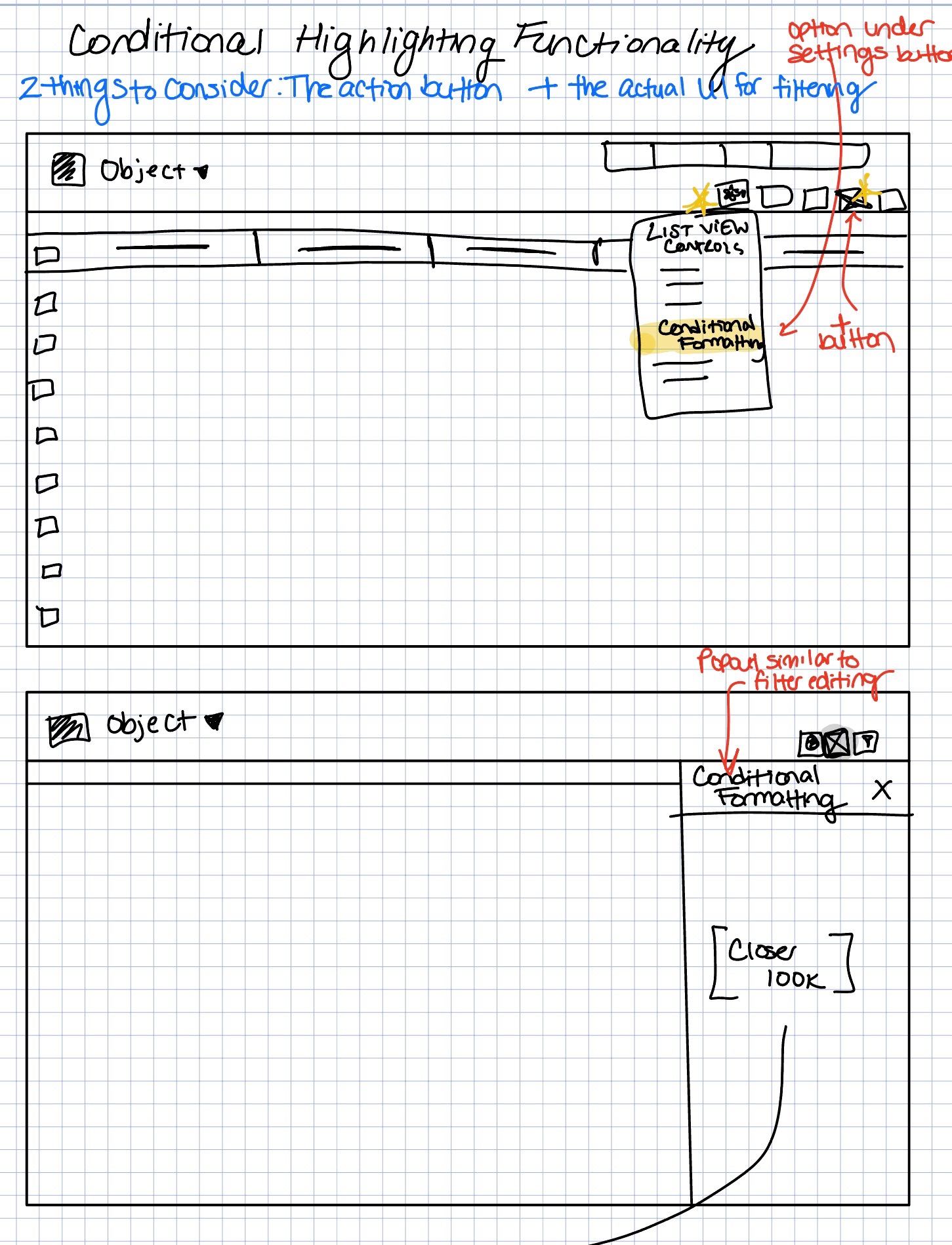
Considering this would be a feature that is vastly different to the current Salesforce List Views tool, to understand the user flow for the conditional highlighting feature, I relied on understanding the current modal components on List Views, finding the similarities between conditional highlighting and standard List View filtering, as well as understanding how competitors that offer conditional highlighting set up their user flow as well.
.png)
When creating wireframes, using my knowledge of the Salesforce list view layout- I was able to ideate on the ways in which the design for the new features could be set up and placed on the already existing List View UI.
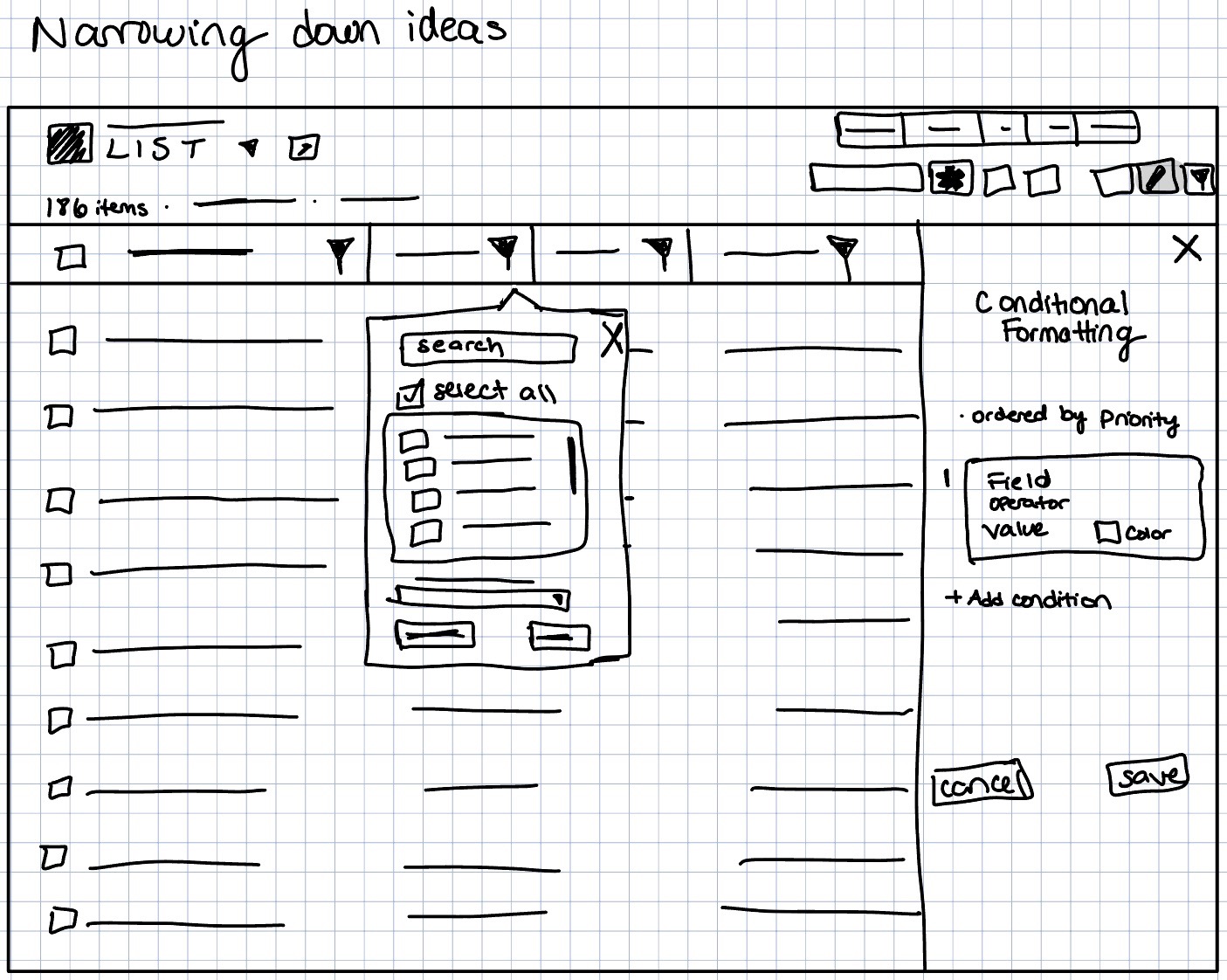
When creating wireframes, I created wireframes for the 3 features separately (below) before combining them onto one screen (above).


Going from paper to digital wireframes allowed me to really narrow down my ideas regarding the new features, what they would look like, and how they would behave.


In order to focus on the journey for each separate feature, for the prototype I was able to create different flows for the three features. And after further iterations I was later able to create an experience that gives testers access to all features within the same flow.
The next step in this desin process was to conduct usability testing. It was important for me to get feedback from REAL Salesforce users who used List Views on a daily basis. Gaining their insight allowed for me to get a better understanding of the usability of these newly designed List View features.
This score highlights that participants were able to successfully complete 87.5% of tasks with little to no assistance, indicating a good baseline of design usability overall.
Based on feedback and insight from the failed usability test tasks, exploring logic on fields outside of numerical ones was incorporated. The CTA was renamed from 'Filter' to 'Apply' to give users more clarity when adding and removing criteria from the quick filters. Also, a new 'Quick Filter' icon that was able to be differentiated from the original filter icon was designed.
.png)
.png)
Based on feedback and insight from the failed usability test tasks, making it clear that there were both row and field options for highlighting and providing help text on the purpose of the new feature will help mitigate user confusion regarding conditional highlighting. I also added help text that appears on hover to help users unfamiliar with conditional formaitting understand how it's used.
.png)

For this project, I was able to create mockups using the Salesforce Lightning Design System (SLDS). I was given guidance for tone, typography, colors, and icons used.
It was also important for me when creating the designs for the new features, to utilize the base component blueprints outlined in the SLDS. In order for these brand new features to be easily noticeable and understandable by Salesforce users that already have familiarity with the look and feel of existing features, having guidance for the look and feel of buttons, checkboxes, picklist selections, color pickers, and more was something essential. All components were available in the Figma UI Kit for Components.
.png)


%20copy.png)
.gif)
In these mockups, the number of all items included in the list view being viewed is shown at the top. Rather than seeing '50+ items' before scrolling down to load the rest of the list, the total number is included for users to know exactly what data they're viewing and taking mass actions on.
Quick filtering using column headers provides users with a way to quickly filter data as they're working without having to create an entirely new list view. Filtering based on numbers, picklist, or text information take on different forms but ultimately allow for users to have a more productive and efficient Salesforce list view experience.
.gif)
.gif)
For the conditional formatting functionality, I took much inspiration from Conga Grid's conditional formatting feature. This new feature allows users to be able to visually mark certain records they are working with based on defined conditions. In this design, the number of conditions that can be applied are limited to two and highlighting an entire row can only be done once in the case that there is any overlap.